


Flutter is a cross platform application development framework, which allows us to create beautiful, natively compiled apps for Android, iOS, Desktop and Web through the use of a single codebase. This means that an app developed by making use of Flutter can run on a variety of devices having different screen sizes, pixel densities and operating systems. It can be run on a device as small as a smartwatch to a device like a large TV.
So, it is really important to ensure that the app looks good on every device regardless of its size or pixel density i.e. it must be responsive. It can be quite challenging to achieve the UI responsiveness for a variety of devices mentioned by the same codebase, but not impossible.
Luckily, creating responsive layouts in Flutter is really easy and straightforward. Flutter offers different widgets that can adapt to different sizes or provide information about the device screen size and orientation:
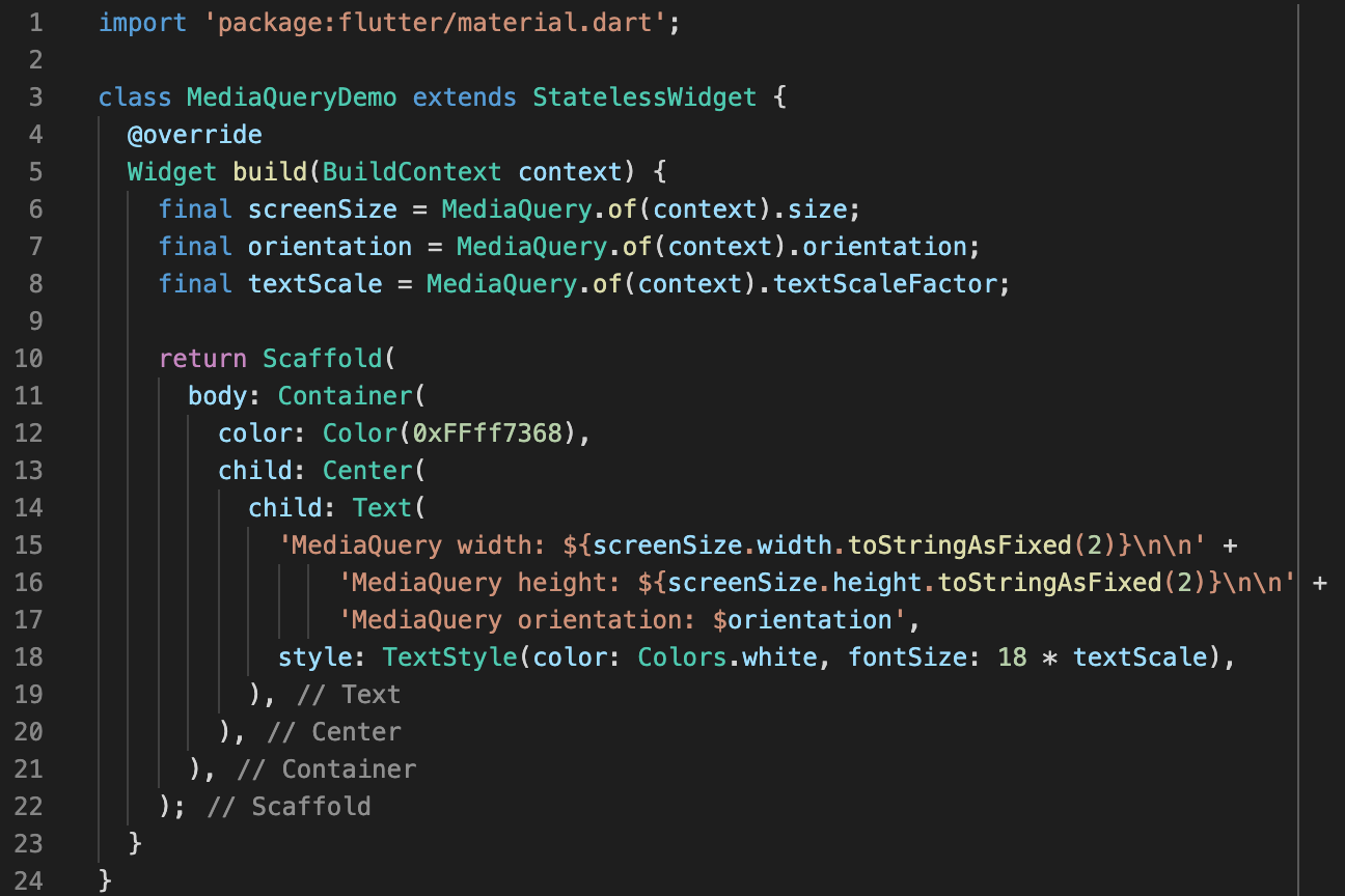
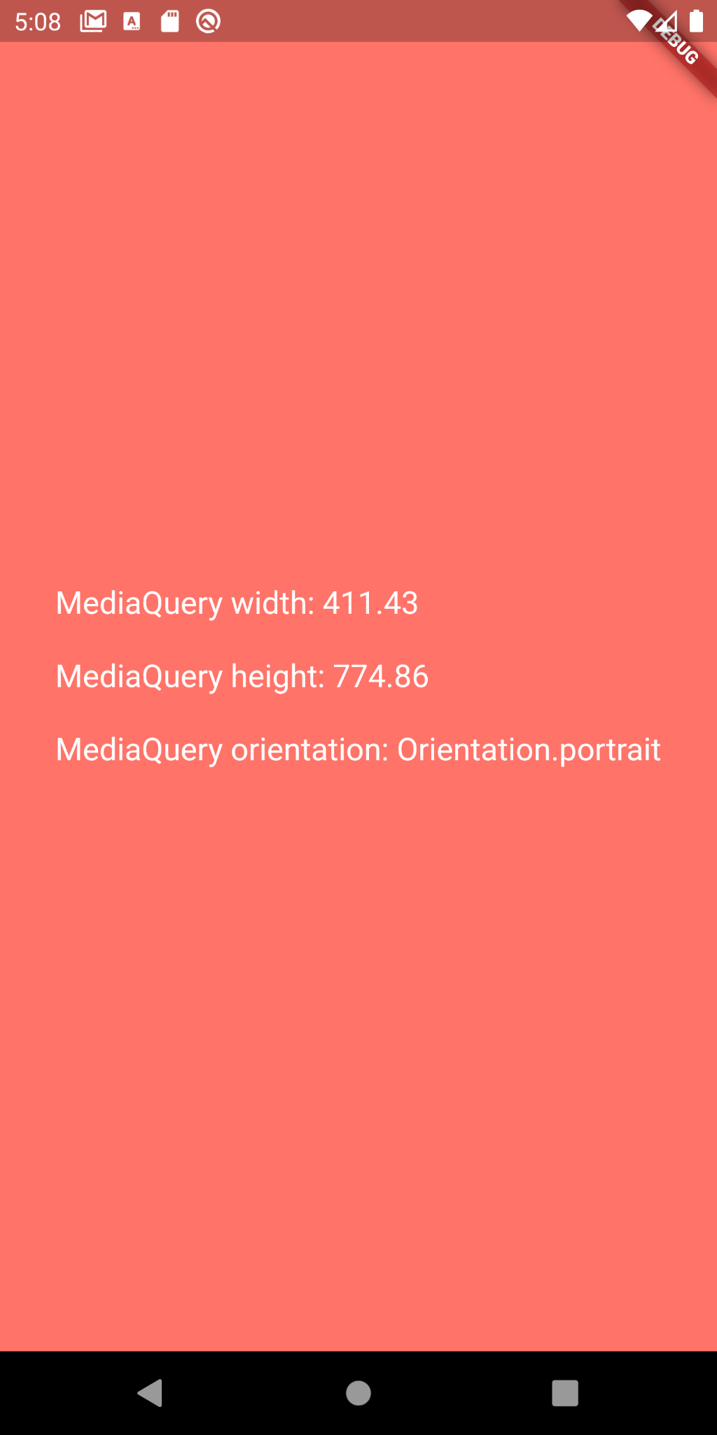
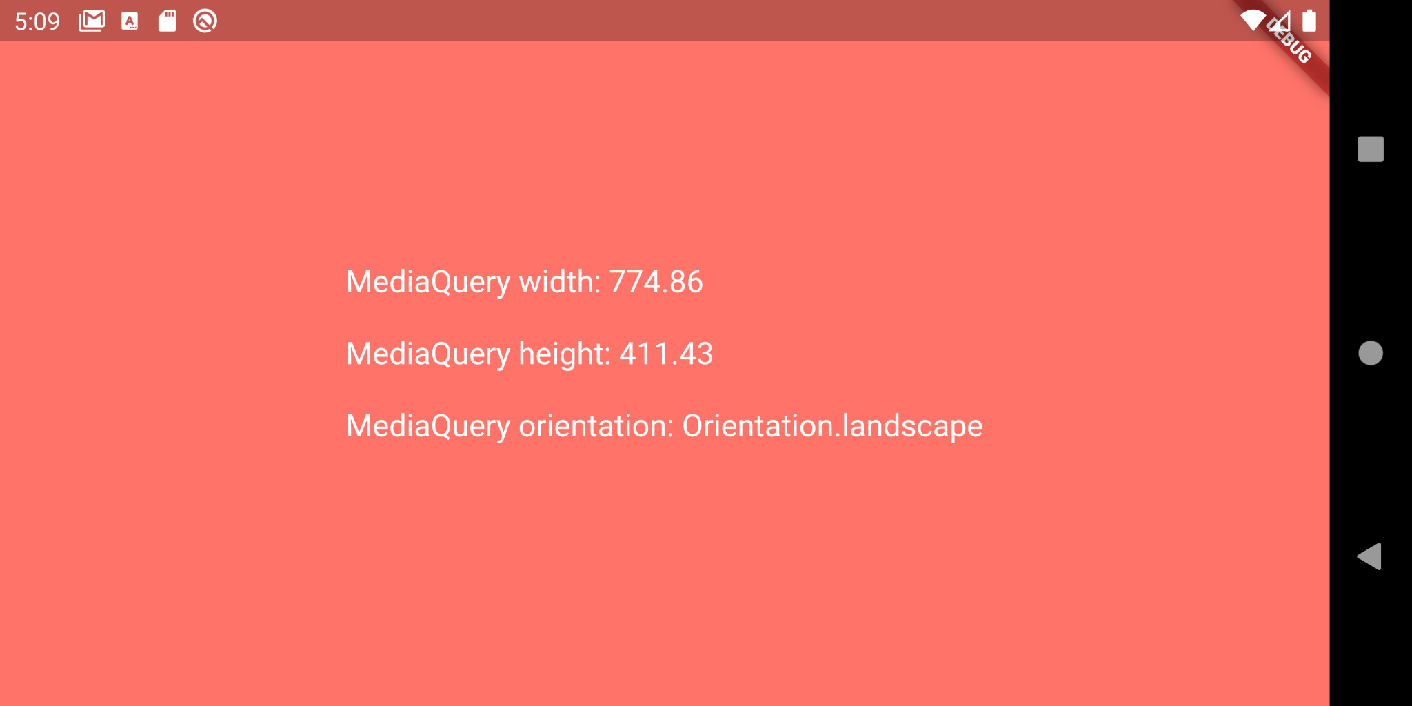
1. MediaQuery:
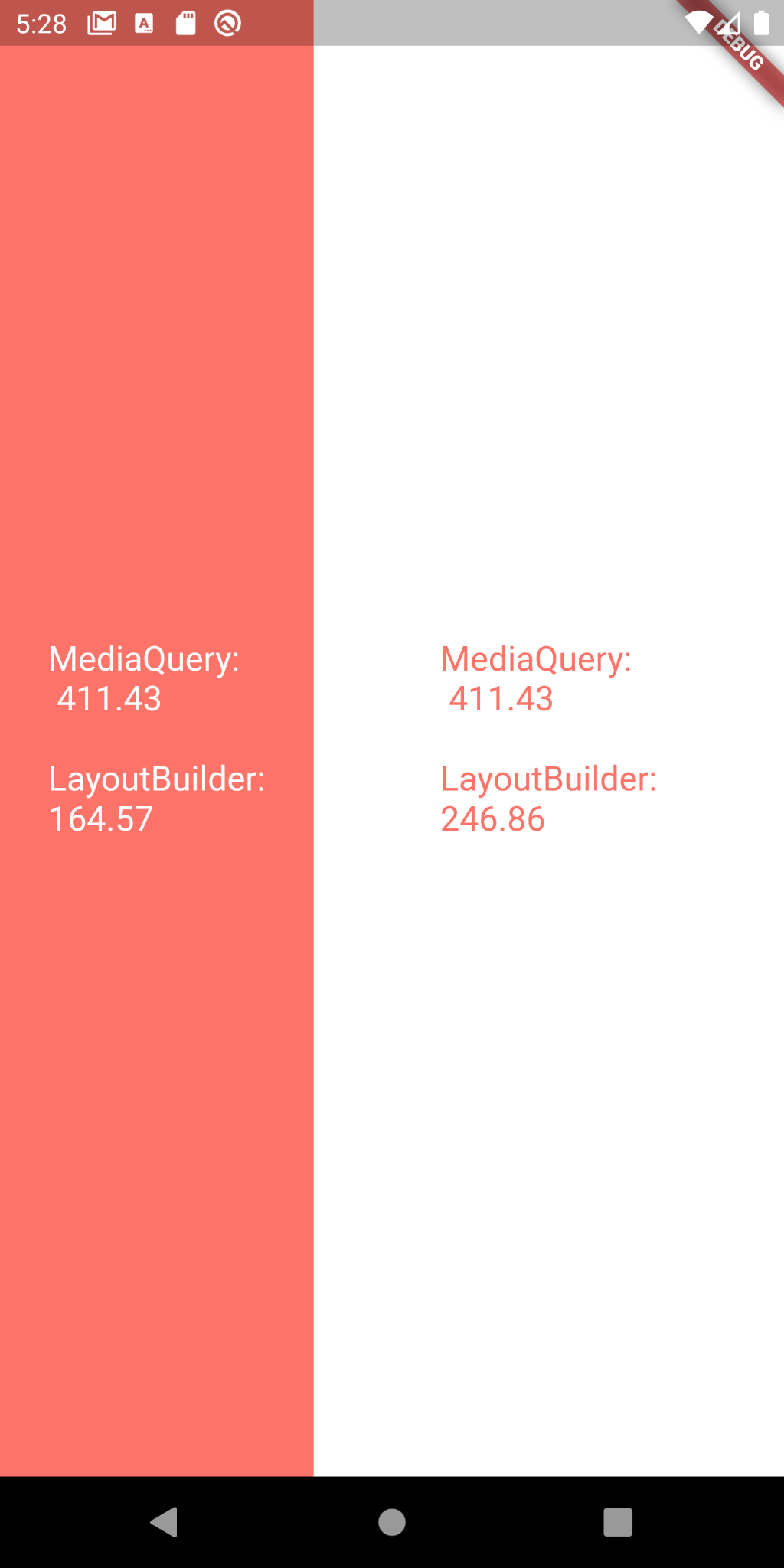
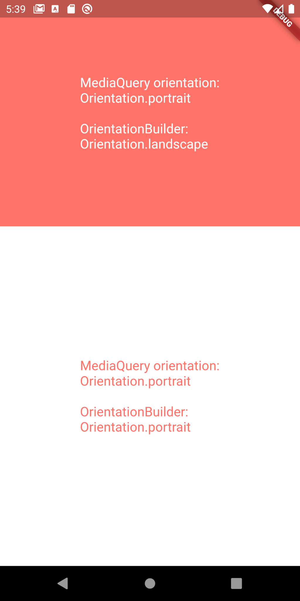
We can use MediaQuery to get information about the device size i.e. width and height, screen orientation, user preferences about the font size and a lot more, which can be quite useful for displaying different layouts based on the available space or current device orientation, for example.


2. LayoutBuilder:
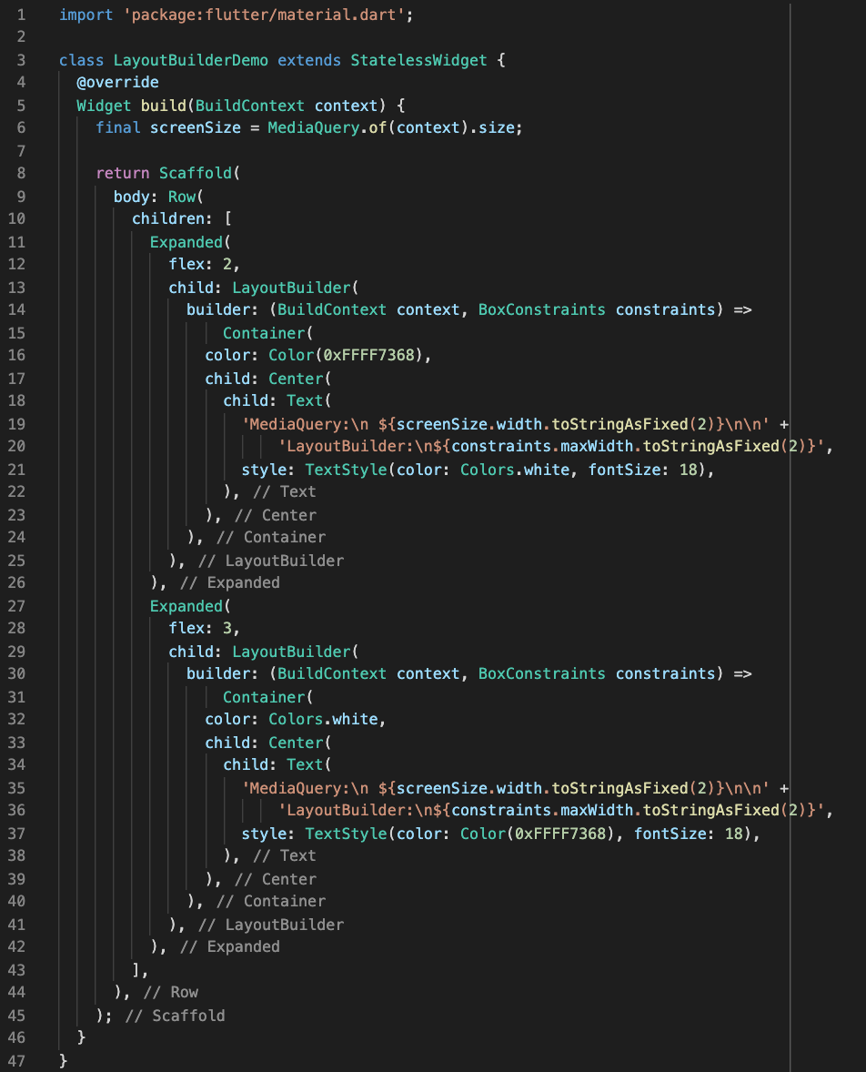
LayoutBuilder class provides the BoxConstraints object, which can be used for determining the maximum width and height of the widget. We can utilize this info to display different children widgets as per the space available. An important point to note is that MediaQuery provides information about the entire screen while LayoutBuilder provides information about a particular widget.

3. OrientationBuilder:
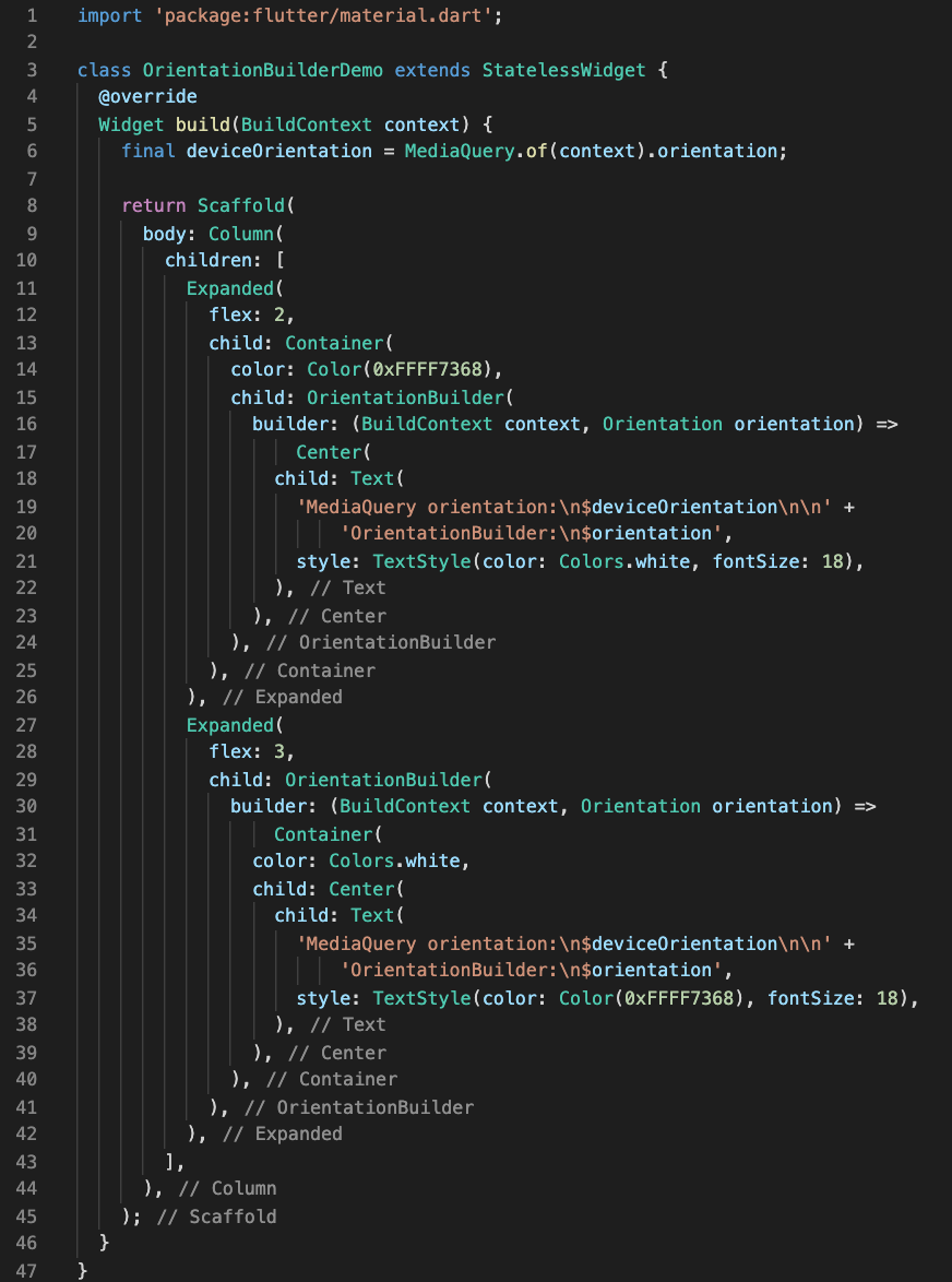
OrientationBuilder class provides information about the current orientation of a particular widget.

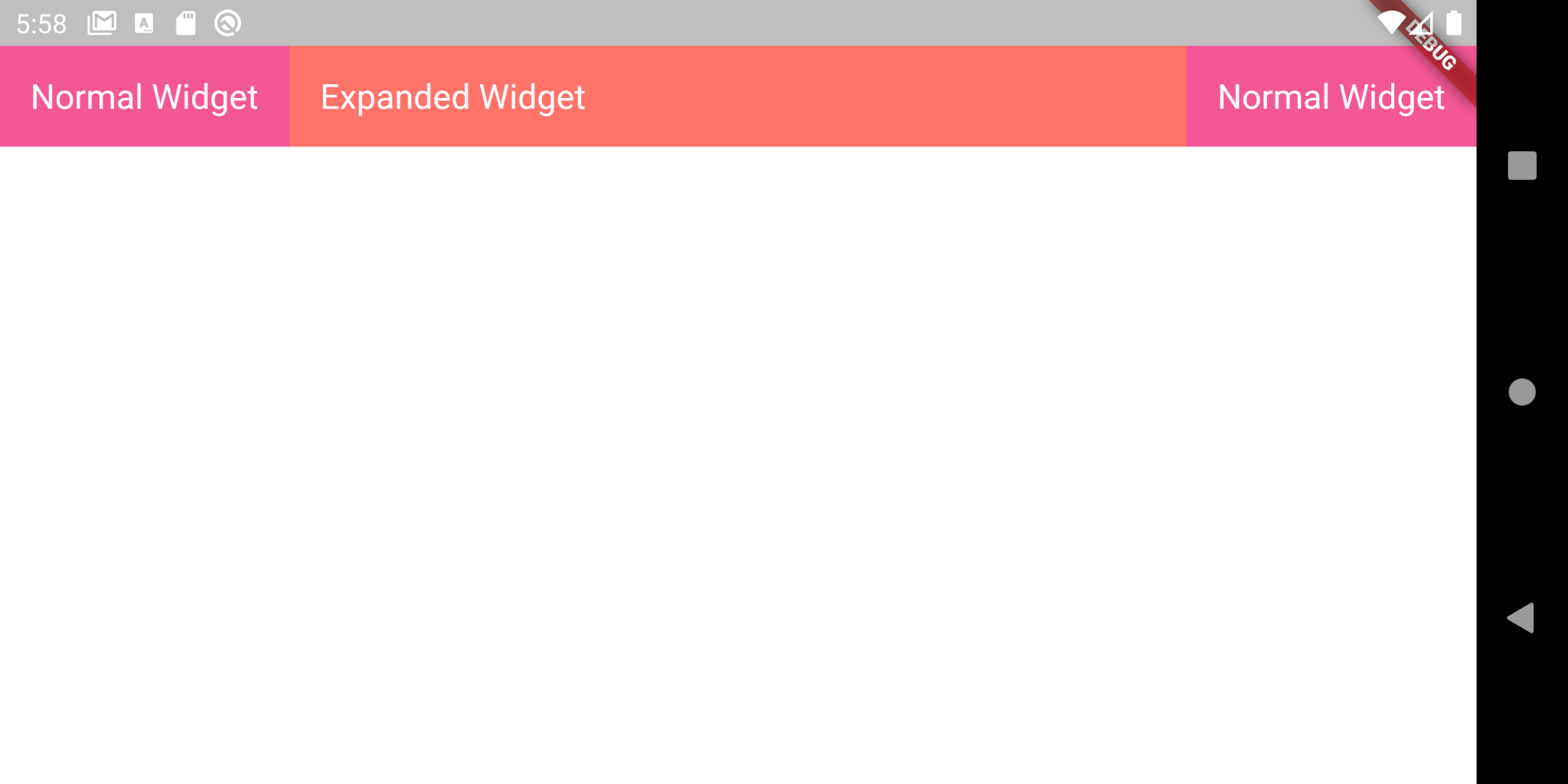
4. Expanded:
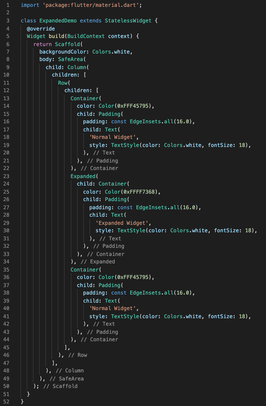
Expanded widget is useful inside a Column or Row widget. It can expand the child widget to fill the available space inside a row or column.

There are a number of other widgets as well such as FractionallySizedBox, AspectRatio, FittedBox, etc. Along with the built-in widgets provided by Flutter, we can also make use of responsive flutter packages/plugins provided by open-source developers some of which are:
Conclusion:
Flutter provides a lot of built-in widgets we can use to make our app UI responsive and make it look good, be it on smartwatch, smartphone, tablet, or a Desktop PC. We can change the size of a particular widget or even display different layouts based on the screen space available. This text could not explore all the widgets or packages available but can be a good starting point for understanding how to build responsive layouts in Flutter.