

React native provides a variety of core components that we can use readily while creating screens for application. Developers can easily create custom components on top of the core components.
The Alert component opens an alert dialog with the sent message and title. An Alert component is used if you want to make sure the user reads the message. It takes away the focus of the screen to alert box and forces the user to read the message.
Alert.alert(
 'Dummy Title For Alert',
 'Dummy Message For Alert',
 [
   {
     text: 'Cancel',
     onPress: () => console.log('Cancel Button Pressed'),
     style: 'cancel',
   },
   {text: 'OK', onPress: () => console.log('OK Button Pressed')},
 ],
 {cancelable: false},
);


By default the OK button is displayed, however, the component provides a list of buttons with respective onPress callbacks. In Android, you can use only three buttons with the concept of positive, negative, and neutral options. In IOS you can use more than three buttons with the style which is one of default, destructive or cancel.
React Native Alert does not support custom styling and animations. If your requirements for the same, we recommend using the React Native Modal.
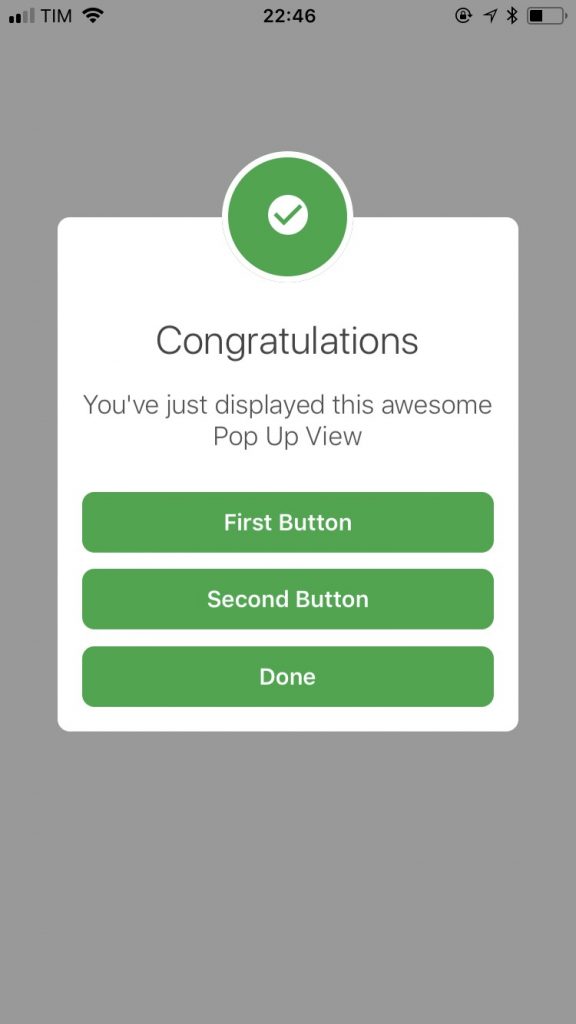
React native Modal can be used as an alert also and it has more functionalities, animations, and styling options as compared to the react-native alert component. In our previous blog, we covered React native Modal, you may find it useful.
     <Modal
         transparent={true}
         visible={this.state.visible}
         animationIn="slideInLeft"
         animationOut="slideOutRight">
         <View
           style={{
             backgroundColor: 'rgba(0,0,0,0.2)',
             alignItems: 'center',
             justifyContent: 'center',
             flex: 1,
           }}>
           <View
             style={{
               width: '90%',
               backgroundColor: 'white',
               padding: 22,
               justifyContent: 'center',
               alignItems: 'center',
               borderRadius: 4,
               borderColor: 'rgba(0, 0, 0, 0.1)',
             }}>
             <Text>Hi, This is dummy alert!</Text>
             <Button
               onPress={() => { this.setState({ visible: false }) }}
               title="Close"
             />
           </View>
         </View>
       </Modal>


You can customize the number of buttons, style header, and body & also add animations as per your need. Modal offers several events which are called when a modal shows or hides.
If your requirement is of simple intimating messages for users you can readily use react native alert. If you need to show an animated alert with custom buttons I recommend using react native modal.
Have I missed something? Please feel free to post in the comments.