

React native offers a list of reusable components to select from. Using these reusable components saves time and avoids duplication. However, developers can easily create custom components as per need.
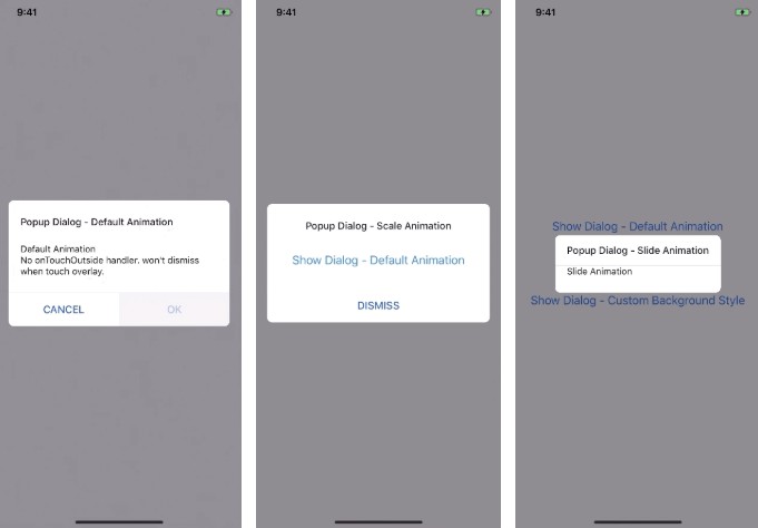
The Modal component provides a foundation to present content above an enclosing view. It can be used to show popovers, alerts, dialogs and much more. React Native offers a basic Modal component which can be customized as per need.
Modal needs to be imported from react-native and we can control its visibility by setting visible prop.
The transparent prop can be used to toggle between the entire view and transparent background.
import {Modal} from 'react-native';

 class Modal extends Component {
   constructor(props) {
   	this.state = {
		isVisible: false,
};
   }
   setVisibility(visible) {
     this.setState({isVisible: visible});
   }
    render() {
     return (
       <View>
         <Modal transparent visible={this.state.isVisible}>
           <View>
             <View>
               <Text>Demo Modal!</Text>
                <TouchableHighlight
                 onPress={() => { this.setVisibility(!this.state.isVisible); }}>
                 <Text>Hide</Text>
               </TouchableHighlight>
             </View>
           </View>
         </Modal>
          <TouchableHighlight onPress={() => { this.setVisibility(true); }}>
           <Text>Show</Text>
         </TouchableHighlight>
       </View>
     );
   }
 }
Full list of props can be found in the official documentation of react-native.
React native is very popular among developers around the world as a large and growing community. React native community offers a more enhanced, animated, and customizable react-native modal. Built on top of react-native modal with much more options animations and styles.

How to make Transparent Background
Modal offers a transparent prop that determines if your modal fills the entire view or not. Setting transparent prop value to true will render the modal over a transparent background and takes away the focus of screen to modal.
How to animate modal
Developers can easily pass animation type in animationIn and animationOut prop. By default animationIn is set to slideInUp and animationOut is set to slideOutDown. Developers can set the timing of animation in ms.
Disabling gestures
Gestures can be controlled by passing value in swipeDirection prop. By default, there is no gesture set. Possible values for the direction where the modal can be swiped are Up, Down, Left or Right. It also supports multiple values that can be passed in an array like ['left', 'right'].
How to center align
To control the alignment of modal content especially in larger devices like iPad or tabs, modal offers presentationStyle property that controls how the modal appears. Possible values are fullScreen (covers the screen completely), formSheet, overFullScreen (Allows transparency, cover full screen).
By default, the presentationStyle prop is set overFullScreen or fullScreen depending on the transparent prop.
Scrollable Content
React Native Modal supports scrollable content inside the modal box. It supports Horizontal scroll too & it can be enabled by setting scrollHorizontal prop to true which is by default false. By setting scrollOffset, content gets scrollable, and swipe to close gesture gets disabled.
I recommend using the community version as it has more options, animations, and features. Documentation can be found at https://github.com/react-native-community/react-native-modal
Have I missed something? please feel free to post in the comments.