

All developers at some point get into the debate of which framework to choose for making a cross-platform app for a given use case as businesses are continuously trying to cut down on development time. And with the ever-increasing innovations in technology, it’s getting harder and harder to reach a verdict of this debate as there are so many good contenders like React Native, Ionic and Xamarin to name a few. Flutter, which is relatively a new addition to the cross-platform dev frameworks list, claims to provide the same cross-platform development capabilities, but it’s got a characteristic which gives Flutter an edge over other platforms. A truly single codebase for native mobile and web apps.
Flutter Internals
Let’s take React and Ionic as examples. They both have their own set of processes to render UI onto the screen of any specific platform.
As we know in the React world. We have different frameworks for web and mobile, ReactJs & React Native. Though when making a web & mobile app we can reuse a lot of the code such as business logic, by implementing certain patterns, but when it comes to the UI elements, we would have to manage two different versions of the component for web and mobile.
On the other hand, Ionic creates the UI elements using web standard (Js, Html & CSS). Ionic styles the components in such a way that it mimics the platform specific style, so we get native look and feel of the components on each platform. And then the app is rendered in a WebView. So basically, Ionic apps are not native apps.
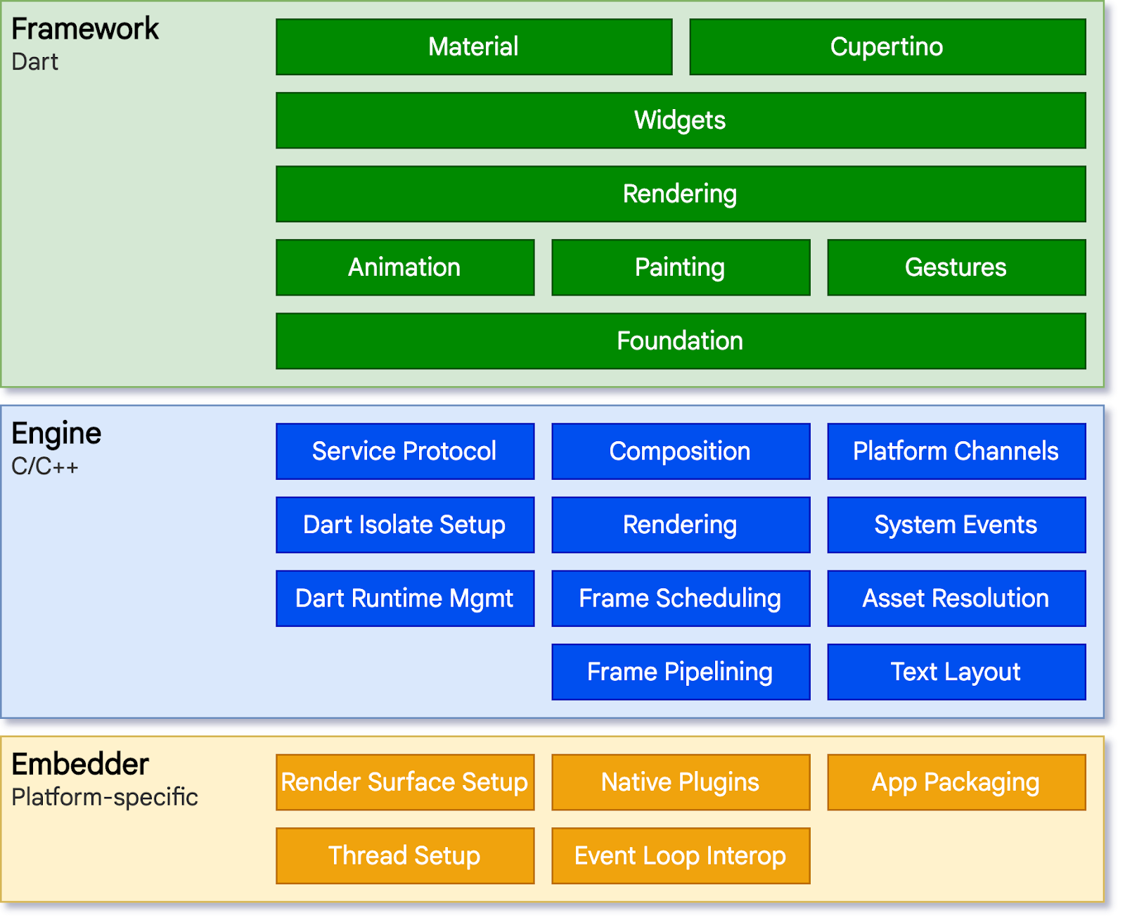
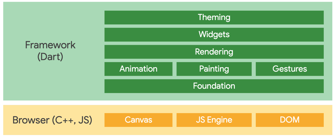
Now flutter takes a completely different approach. It does not translate the components into native components or render it in any WebView container, it works more like a gaming engine where it takes complete control of the screen and by using its own high-performance rendering engine, draws every pixel of the UI onto the screen using Skia canvas.

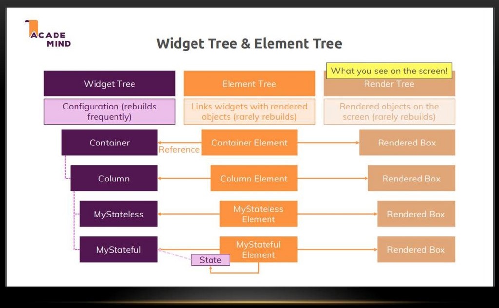
Some might argue that it might be more performance costly to redraw each component, but Flutter has a very optimized process of traversing its widget tree and rendering only the part of UI (widget) which needs to be redrawn.

Native UI/UX
Since flutter is painting every pixel, one would think that it would be more time consuming to develop individual styles for every component & platform, but that is not the case. Flutter provides its extensive set of pre-defined adaptive widgets right out of the box. Including a set of Material and Cupertino styled widgets for Android and iOS respectively. Same widgets can be rendered on the web as well. As many developers would already be familiar with using material design in web apps, if a Flutter app is built using Material widgets, they would have consistent look and feel in both of their mobile and web apps.
Base components like switches can be used in an adaptive way so that a single line of code gets rendered according to the platform it’s running on.


Flutter also provides device specific information which a developer might need to make some decisions for widget styling or making responsive layouts such as:
- Platform.isAndroid
- Platform.isIos
- kIsWeb
- MediaQuery.of(context).orientation
- MediaQuery.of(context).size.height
Flutter Web
Introduction of web support in Flutter has made it truly unique. With this support, existing codebase written for mobile apps in Dart language can be compiled for the web as well using web-standards (Js, Html & CSS).
As we know, the flutter dart framework layer itself is platform agnostic as it sits above a Rendering layer, which is written for each specific platform. To enable web support, Flutter team just had to implement its core drawing layer which uses standard browser’s APIs to access DOM and Canvas to draw the app onto the screen. And in addition, had to enable compiling dart code into JavaScript instead of ARM machine code which is done for mobile apps.

Demo app for web & mobile
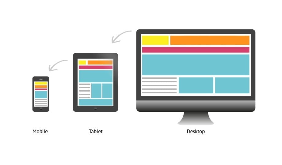
In order to demonstrate how one codebase can be used for both web and mobile apps, We’ve pulled together a demo flutter app which showcases all the building blocks of Flutter and we can see how they render on different devices. This app has implemented Material Design and we’ll be testing on Android mobile, Android Tab and Web (Chrome). See the demo videos of each device for reference. Link to the source code of the app is mentioned in the References section.
MaterialApp, Scaffold, AppBar & AppDrawer
These 4 widgets together define the overall layout of the app. The top bar, a togglable side menu and the body for the app. By adding them without any platform specific tweaking, we get the result shown in the app.
Layout
Now this will be the most important aspect when developing an app for both mobile and web. The theory behind responsive layout that we are familiar with in the web dev world, are applied here as well. Flutter provides many ways to lay out our content. But we have to configure them in a way that the content stays responsive across different devices and screen sizes. Following are some of the widgets Flutter provides for layouts:
Container, Rows & Columns
These are the widgets that you will find that are used most. They are normally used in conjunction to make up our entire content. In this app, all screens in our demo are wrapped in a container, whose width is set dynamically with the help of media query.

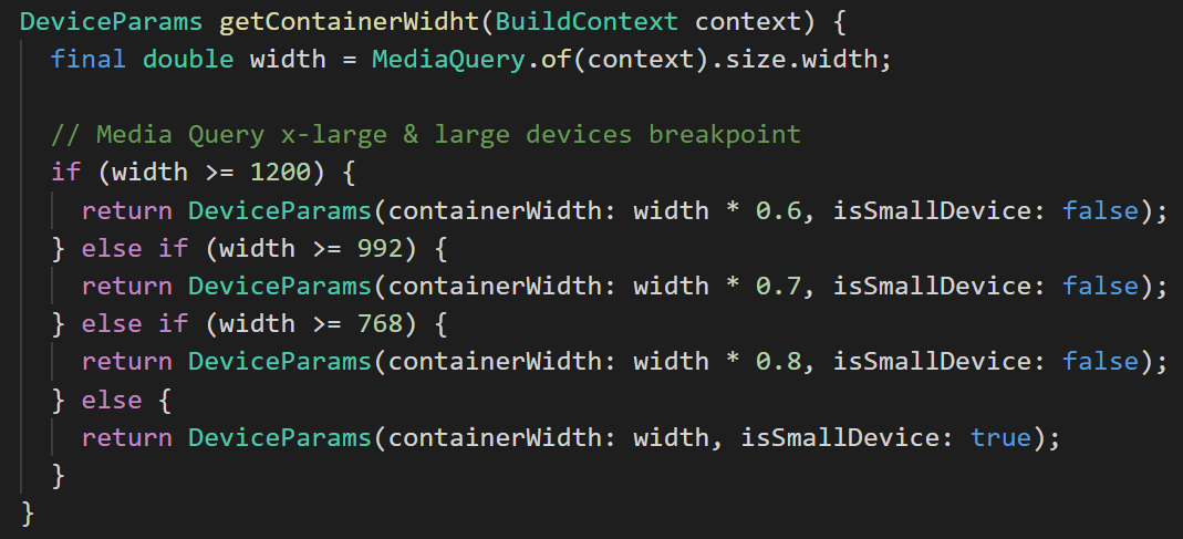
Based on the standard media query breakpoints for medium, large and xl devices, we set the container width dynamically so that in smaller screen, we use the whole width of the screen, and as we go towards bigger screens, we take smaller percentage of the whole screen so that our components are not stretched all the way across on computer monitors for example. A red border has been added around the main container so you can estimate how big the container is on the screen.
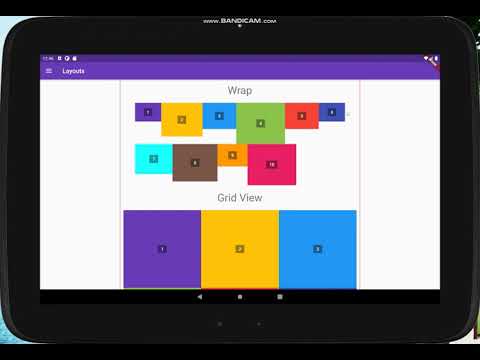
Flex, Wrap & Grid
These are some other ways to layout the content. Flex follows a similar pattern of flexbox from the web world where we can tell flutter how the content should be sized comparatively to the others. Wrap, as the name suggests, wraps the content in the next row/column if the content overflows. Grid also is very common. It’s used a lot with showing let’s say a picture collection or multiple cards. In this app, as there’s no content within the grid, it is automatically sized according to the space available.
Form Controls
Some commonly used form controls have been added in the app to show how they look on different screens. Note that “Wrap” has been used in this screen so that’s why we see small containers move to the next rows in smaller screens.
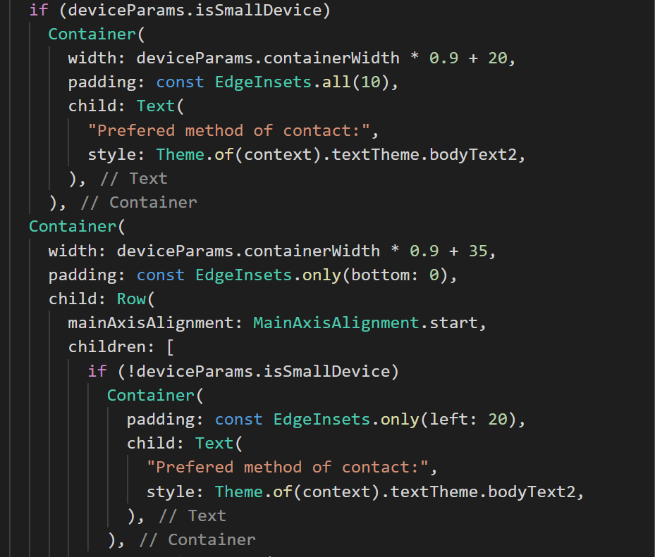
With the help of these controls, we’ve pulled together a sample form. The width of these controls is set dynamically by using the width of the main container (deviceParams.containerWidth) that we defined at the beginning. So, for one text field, we take 45% of the width of the main container minus some padding, so that in one row, we get maximum of two fields (45*2 i.e. 90%) along with an icon (10%).


Also based on the device, we can set either we want to show some content in a single or multi line. This example is of the checkboxes and radio button on the contact form.

Tabs, Lists & Tables
Tabs are normally used with the Scaffold widget in Flutter so that it takes the same size as our top AppBar which is what followed in mobile material layouts. But as we were planning to use the same Tab Widget on the web, we added them in our body container instead of the scaffold.
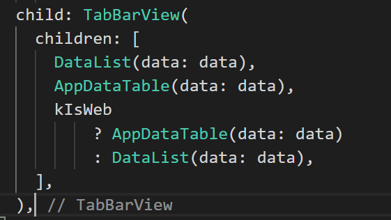
ListView widget helps with creating dynamic list content which is scrollable by default. Inside we’ve used List items which gives us a nice layout of the items including avatars, title, subtitle and trailing info. Similarly, Material also provides a DataTable widget which is highly customizable. In this example, we have used a very basic “cars” data to visualize both ListView and DataTable.
Generally, displaying data in a table would make sense on a web app, but as we already have limited screen real estate on mobile, showing a table would either make it squished and unreadable or would be horizontally scrollable which is really painful to use. We can fix this very easily in Flutter by rendering our desired widget based on platform or screen size as it is done in the “adaptive” tab in our demo app.

Alerts, Panels & Stepper
Alerts, Dialog popups, notifications etc. can also be used in a similar manner.
Considerations
Now that we’ve seen basics and how Flutter can be used for web apps, there’s still some factors about Flutter web that should be considered:
- Flutter web was initially managed in a separate repo. Though it is merged into the main Flutter codebase, it’s still in beta and Flutter team is still trying to improve upon its quality and performance. So, you may run into some issues and bugs as it’s not yet completely stable.
- As for the performance, there are primarily two factors that we see when measuring performance of a web app. One is handling large data and second, effects & animations. Dart handles large lists reasonably well but the Flutter web is still trying to improve the performance when it comes to animations, so you might not get the buttery smooth transitions or animations like you get from other frameworks yet.
- Since it’s not stable, a good amount of time would be spent on testing the apps.
- There are plenty of 3rd party libraries that you can use for Flutter mobile, but for web there are comparatively less. So, e.g. if you are planning to use features such as getting location of your user, you will find a lot of options of libraries to choose from for iOS and Android but you might not find any one package which supports web as well.
Final Thoughts
We’ve got some idea now on how powerful Flutter is when it comes to cross platform development even when the web is still in beta. Though we might not want to use Flutter web for let’s say a full-fledged e-commerce store at the moment, but as rapidly its development is being done, I believe we are not that far from the first stable version of Flutter web and start enabling web support for our existing Flutter codebases. With its ever-growing popularity and how more & more developers are leaning towards Flutter now, it’s giving a hard time to its competitors.
Demo:
Web Application

Tab Application
Mobile Application
