

NativeScript is a cross-platform mobile app development framework that helps developers build apps for multiple mobile platforms from the same code, using just JavaScript and XML; saving them from having to learn platform specific languages like Swift, etc. Apps built using NativeScript work exactly the same as those built using languages like Swift or Java, so there’s no difference in the user experience.
Although the NativeScript framework provides a wide variety of controls you can use to create complex UIs, you often come across scenarios where you need to reuse some controls throughout your app or even multiple times on a particular page. In those situations, you need custom controls, that can be used multiple times in the app. In this tutorial, I’ll show you how to create a custom control and how to use it multiple times in your app.
To do that we’ll build a simple quiz app which will present users with a list of questions. Each question will offer multiple choice answers out of which the user will have to select one. Simply put, we’ll be creating a MCQ questionnaire app.
There are two ways to create a custom control in NativeScript, either by using XML with a code file or by just using the code file. The former method is used for scenarios when you don’t have to deal with custom properties and methods. If however you want to add custom properties and methods to your app’s controls, then the only way to do that is to create your own custom control(s) using the code file method. That is because the properties you want to access need to reside in a class and to access those properties you need to write the control class yourself.
Open your terminal/cmd line interface and cd into the directory where you want your project to be in. Run the following command to create an empty project.
tns create QuizApp --template tns-template-blank
Note
If you want to just skip ahead to the code without doing the tutorial, head on over to this link – https://github.com/mdanishs/QuizzApp.
Now, move to the newly created project folder and in the app folder create a folder named custom-controls (or any name you want), within the custom-controls folder add two (2) sub folders with names in there with the names question-control-xml and question-control-code. These two folders will house the code files for the two different methods I mentioned above. i.e. the XML with the code behind method and the single code file method. With these 2 folders added, your app folder should have the following hierarchy:
App
|__ App_Resources
|__custom-controls
	|__question-control-code
	|__question-control-xml
Now, create a new file in the question-control-xml folder and name it QuestionControl.xml, and add the following code to it.
<StackLayout loaded="onLoaded">
  <Label text="How many colors are there?" textWrap="true"/>
  <StackLayout>
    <Label id="1" text="Infinity" textWrap="true"
        tap="onAnswerTap"/>
    <Label id="2" text="Three Only" textWrap="true"
        tap="onAnswerTap"/>
    <Label id="3" text="There are no colors" textWrap="true"
        tap="onAnswerTap"/>
  </StackLayout>
</StackLayout>
This is a simple control with static data, which is not of much use to us right now but we can still try including in other views.
To include a custom control on your page, you will have to first give it a namespace and then use it through that namespace. To do so, in your main-page.xml file (which should reside directly under the app directory), add the following code.
<Page
    xmlns:CustomControls="custom-controls/question-control-xml">
    <CustomControls:QuestionControl/>
</Page>
In the above code, we have declared a namespace with the name CustomControls and have assigned it a path to the directory where our XML file is present. After that, we have added our control as a child to the page. You’ll notice that in the third line of the above code snippet, after the namespace, we’ve mentioned the exact file name of our xml.
When you run the application to this point, you’ll see the following screen.

Now, in the same folder where the XML currently resides, add a CSS file named QuestionControl.css. Make sure to name this the exact same name as your XML file. Next, add the following styles to your file.
.question{
    padding: 10;
    color: white;
    background-color: darkGray;
}

.answer{
    padding: 10;
    color: white;
    background-color: #E3E3E3;
}

.selected-answer{
    padding: 10;
    color: white;
    background-color: orange;
}

.separator{
    height: 1;
    background-color: lightGray;
    width: 100%;
}
Apply the above styles to your XML, just like you would apply them to your normal page views.
<StackLayout loaded="onLoaded">
  <Label text="How many colors are there?" textWrap="true"
      class="question"/>
  <StackLayout>
    <Label text="Infinity" textWrap="true" class="answer"
        tap="onAnswerTap"/>
    <StackLayout class="separator"/>
    <Label text="Three Only" textWrap="true" class="answer"
        tap="onAnswerTap"/>
    <StackLayout class="separator"/>
    <Label text="There are no colors" textWrap="true" class="answer"
        tap="onAnswerTap"/>
  </StackLayout>
</StackLayout>

Just like Views, you can also handle Events with the code-behind file, by binding them with the properties in the XML file. To see how that works, we’ll add two functions to our file, which will basically be the event handlers for control’s loaded event and answer’s tap event.
So, in the same directory where the XML and CSS files are present, add another file with the same name i.e. QuestionControl.js and add the following code to it.
var control = null, selectedAnswerView = null;
exports.onLoaded = function(args){
    //assigning the control object to be used in other functions
    control = args.object;
}

exports.onAnswerTap = function(args){

    if(selectedAnswerView == null){
        //if no object is selected, select the current tapped object
        selectedAnswerView = args.object;
        selectedAnswerView.className = 'selected-answer';
    }else{
        //first deselect the previously selected object
        selectedAnswerView.className = 'answer';
        selectedAnswerView = args.object;
        selectedAnswerView.className = 'selected-answer';
    }
}
The above function basically receives the arguments in the event data. It is the event handler for the answer’s tap event. It just checks to see if the ‘there are no colors’ answer (depicted below) is highlighted. If it is, then that option should get selected, otherwise it removes the previous selection and assigns the next one.

Next, let’s try dynamically binding the data instead of hardcoding it into the control itself. In the snippets below, the main-page.js has been changed to add a bindingContext to the page with questions and answers passed in. The main-page.xml file now uses the mustache syntax to bind the properties to the binding context.
main-page.js
exports.onLoaded = function(args){
    var page = args.object;
    page.bindingContext = {
        question:"How many continents are there?",
        answers:["7 Continents",
                "1 Continent",
                "There are no continents"]
    }
}

main-page.xml
<Page loaded="onLoaded"
    xmlns:CustomControls="custom-controls/question-control-xml">
    <CustomControls:QuestionControl question="{{question}}"
        answers="{{answers}}"/>
</Page>
Furthermore, I have also added a console.log statement in QuestionControl.js, which tries to log the question property which has been passed by the main-page.xml.
QuestionControl.js
exports.onLoaded = function(args){
    //assigning the control object to be used in other functions
    control = args.object;
    console.log(control.question);
}
If you run the above code, you will see the following log error saying undefined.
This proves that you cannot work with custom properties if are building your custom control using the code behind file technique.
In the next section, I’ll show you how to create the same control using the code only file technique and how to add custom properties to the control to allow data binding with custom properties.
The only way to add custom properties to your custom made controls is to create your own class extending a built-in control, like a view for example, and add your desired functionality to it.
Let’s start with the basics. First, just show a Label in a StackLayout and use it in our XML as a custom control. Then, in your question-control-code folder create a new file and name it QuestionControl.js. This is the only file we will need to write our control’s functionality.
The code snippet below extends our class from StackLayout and adds a label to it as a child.
var StackLayout = require("ui/layouts/stack-layout").StackLayout;
var Label = require("ui/label").Label;

var Control = (function (_super) {
    global.__extends(QuestionControl, _super);

    function QuestionControl() {
        _super.call(this);

        var lblTitle = new Label();
        lblTitle.text = "Custom Label Control";

        this.addChild(lblTitle);

    }
    return QuestionControl;

})(StackLayout);

exports.QuestionControl = Control;
In the snippet above, the global.__extends function gives the same prototype to our class as the _super class, which in our case is the StackLayout. We are then creating a new Label using the label module and adding it to the new instance of the class.
The name of your control depends on the name you export it with, so exports.QuestionControl shows that we have named our control “QuestionControl”.
Use this control in your main-page.xml as
<Page loaded="onLoaded"
    xmlns:CustomControls="custom-controls/question-control-code/QuestionControl">
    <CustomControls:QuestionControl/>
</Page>
You’ll notice that our namespace now points to the code file instead of the directory where the code file is present, and the name QuestionControl following the CustomControl namespace, is the name we have used for exports in the code file.
If you run the above code you’ll see something like this.

Next, let’s add a custom property to make the text in the control dynamic.
To do so, add the following code after the global.__extends call. This will add the customText property to the prototype of our control class. To read more about the define property method, head on over to this link.
Object.defineProperty(QuestionControl.prototype, "customText",{
        get: function(){
            return this._customText;
        },
        set: function(value){
            this._customText = value;
            this.updateLabelText();
        }
});
You will notice that we’ve used the updateLabelText method in the above code. That’s because this method helps us to update the text of the label whenever we try to assign a new value to our property.
Next, we’ll change the QuestionControl class to add the _customText variable and the method to handle UI updates (as shown below).
function QuestionControl() {
    _super.call(this);

    this._customText="";
    var lblTitle = new Label();

    this.updateLabelText = function(){
        lblTitle.text = this._customText;
    }

    this.addChild(lblTitle);

}
Now, let’s try using this control a few times in our page, providing different values to the property each time.
<Page loaded="onLoaded"
    xmlns:CustomControls="custom-controls/question-control-code/QuestionControl">
    <StackLayout>
        <CustomControls:QuestionControl customText="This is my text"/>
        <CustomControls:QuestionControl customText="I am reusing the control"/>
    </StackLayout>
</Page>

Now that you know how to create custom controls using the code file only technique, I’ll just skim through Creating the real Question Control tutorial. The following section describes the code snippets and steps I went through to build this custom control.
First, I added two properties to the class prototype namely, question and answers so that they can be accessed in the xml.
Object.defineProperty(QuestionControl.prototype, "question",{
    get: function(){
        return this._question;
    },
    set: function(value){
        this._question = value;
        this.populateData();
    }
});

Object.defineProperty(QuestionControl.prototype, "answers",{
    get: function(){
        return this._answers;
    },
    set: function(value){
        this._answers = value;
        this.populateData();
    }
});
Then, I implemented the populateData function in the class to reflect changes in the UI whenever the property changes. This function dynamically creates the labels and adds them to the current stack and sets the styles with the className property, so that they look good on the app’s UI.
this._question="";
this._answers=[];
var selectedAnswerView = null;

this.populateData = function(){
    this.removeChildren();
    var lblQuestion = new Label();
    lblQuestion.text = this._question;
    lblQuestion.className = "question";
    this.addChild(lblQuestion);

    for(var i=0; i<this._answers.length; i++){
        var lblAnswer = new Label();
        lblAnswer.className = "answer";
        lblAnswer.text = this._answers[i];

        lblAnswer.on('tap', function(){
            onAnswerTap(this);
        }.bind(lblAnswer));

        this.addChild(lblAnswer);

    }
}
This function also attaches the event handler onAnswerTap to every label which performs a similar operation as the function we defined when working with the xml technique (above)
function onAnswerTap(args){

    if(selectedAnswerView == null){
        //if no object is selected, select the current tapped object
        selectedAnswerView = args;
        selectedAnswerView.className = 'selected-answer';
    }else{
        //first deselect the previously selected object
        selectedAnswerView.className = 'answer';
        selectedAnswerView = args;
        selectedAnswerView.className = 'selected-answer';
    }
}
Your control should now work as you expect it to. Just update the main-page’s XML and JS files to use the control with dynamic data.
main-page.xml
<Page loaded="onLoaded"
xmlns:CustomControls="custom-controls/question-control-code/QuestionControl">
<StackLayout>
<CustomControls:QuestionControl question="{{question1}}" answers="{{answers1}}"/>
<CustomControls:QuestionControl question="{{question2}}" answers="{{answers2}}"/>
</StackLayout>
</Page>
main-page.js
exports.onLoaded = function(args){
var page = args.object;
page.bindingContext = {
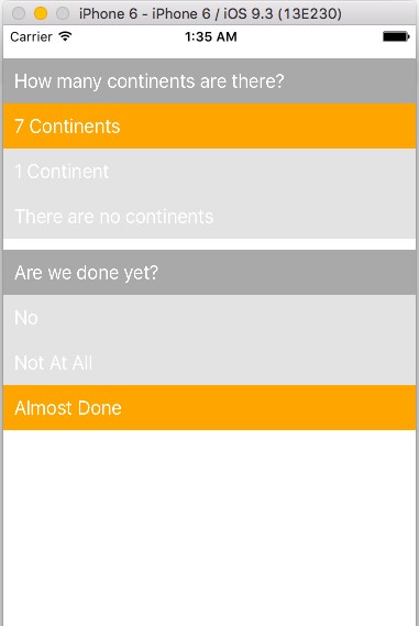
question1:"How many continents are there?",
answers1:["7 Continents",
"1 Continent",
"There are no continents"
],
question2:"Are we done yet?",
answers2:["No",
"Not At All",
"Almost Done"]
}
}
You should see your control working as depicted below.
When you have the custom control working, you might want to listen for events from your control, or trigger some custom events yourself. Learn more about custom events.
In our case, we want to listen to the event when the selection changes, at which point, we can call the notify method to trigger the event in our onAnswerTap function.
this.notify({
   eventName:"selectedValueChanged",
   object:this,
   selectedView: args
});
In order to listen for this event when it is triggered, in your main-page.xml file assign your custom control an id and get the view by id in your JS file. Then, subscribe to the event using the on method. For example:
var questionControl = page.getViewById('your-control-id');
questionControl.on('selectedValueChanged',function(eventData){
    //you will recieve the event data here
});
var StackLayout = require("ui/layouts/stack-layout").StackLayout;
var Label = require("ui/label").Label;
var enums = require("ui/enums");


var Control = (function (_super) {
    global.__extends(QuestionControl, _super);

    Object.defineProperty(QuestionControl.prototype, "question",{
        get: function(){
            return this._question;
        },
        set: function(value){
            this._question = value;
            this.populateData();
        }
    });

    Object.defineProperty(QuestionControl.prototype, "answers",{
        get: function(){
            return this._answers;
        },
        set: function(value){
            this._answers = value;
            this.populateData();
        }
    });


    function QuestionControl() {
        _super.call(this);

        this._question="";
        this._answers=[];
        var selectedAnswerView = null;

        this.populateData = function(){
            this.removeChildren();
            var lblQuestion = new Label();
            lblQuestion.text = this._question;
            lblQuestion.className = "question";
            this.addChild(lblQuestion);

            for(var i=0; i<this._answers.length; i++){
                var lblAnswer = new Label();
                lblAnswer.className = "answer";
                lblAnswer.text = this._answers[i];

                lblAnswer.on('tap', function(){
                    onAnswerTap(this);
                }.bind(lblAnswer));

                this.addChild(lblAnswer);

            }

        }

    var onAnswerTap = function(args){

        if(selectedAnswerView == null){
            //if no object is selected, select the current tapped object
            selectedAnswerView = args;
            selectedAnswerView.className = 'selected-answer';
        }else{
            //first deselect the previously selected object
            selectedAnswerView.className = 'answer';
            selectedAnswerView = args;
            selectedAnswerView.className = 'selected-answer';
        }
        this.notify({
            eventName:"selectedValueChanged",
            object:this,
            selectedView: args
        });
    }.bind(this);


    }
    return QuestionControl;

})(StackLayout);

exports.QuestionControl = Control;
With this functionality you can create any type of custom controls you want re-use throughout the app. You can read more about creating custom controls and dynamically loading them into other custom controls in The Basics section provided by the NativeScript. If you want to create a custom control which cannot be created by using the given components, but is present in the platform’s native controls, you might want to have a look at UI Plugins.
Note: All of the code used in this tutorial is available at https://github.com/mdanishs/QuizzApp
USA408 365 4638
1301 Shoreway Road, Suite 160,
Belmont, CA 94002
Whether you are a large enterprise looking to augment your teams with experts resources or an SME looking to scale your business or a startup looking to build something.
We are your digital growth partner.
Tel:
+1 408 365 4638
Support:
+1 (408) 512 1812


COMMENTS (0)
Tweet